In today’s digital age, a user-friendly interface is key to the success of any website or application. A well-designed interface with buttons, boxes, and menus can make a significant difference in user experience, engagement, and ultimately, conversion rates. In this comprehensive guide, we will delve into the importance of these elements and provide practical tips on how to design them effectively.
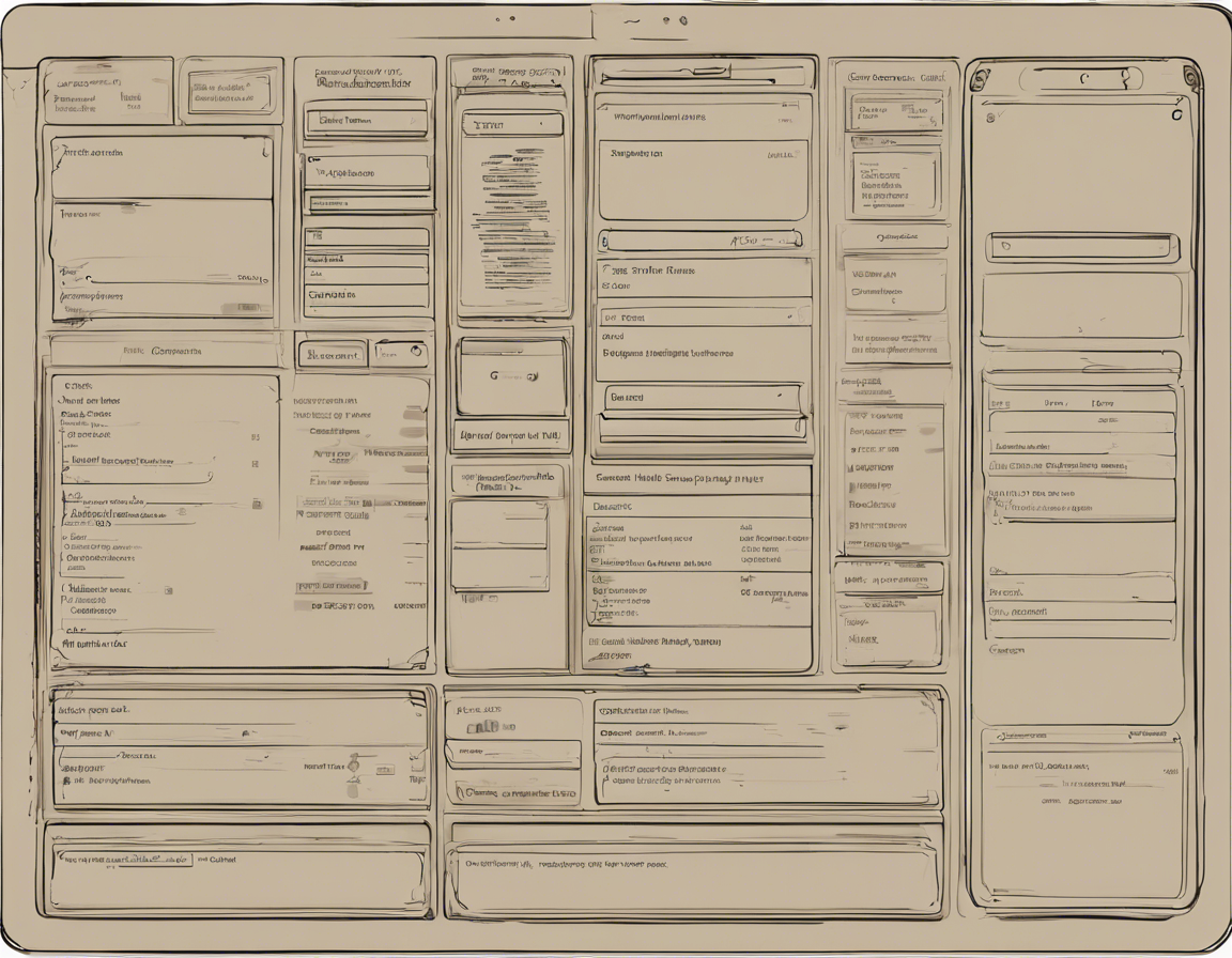
Importance of Buttons, Boxes, and Menus in User Interface Design
Buttons
Buttons are one of the most fundamental elements of a user interface. They are used to trigger actions, submit forms, navigate to different pages, and more. Clear, visually distinct buttons that are easy to identify and interact with can greatly enhance the user experience. When designing buttons, consider the following:
– Color: Use contrasting colors that stand out against the background to draw attention to the button.
– Size: Make buttons large enough to be easily clickable, but not so large that they overwhelm other elements on the page.
– Placement: Position buttons where users expect them to be, such as at the end of a form or next to a call-to-action.
Boxes
Boxes, also known as containers or panels, are used to group related content together visually. They help to organize information on a page and create a sense of hierarchy. When designing boxes, keep the following in mind:
– Consistency: Use consistent box styles throughout the interface to create a cohesive look.
– Whitespace: Leave enough whitespace around boxes to help them stand out and improve readability.
– Borders and Shadows: Consider using borders or shadows to give boxes depth and make them visually distinct.
Menus
Menus are essential for navigation within a website or application. Whether it’s a simple dropdown menu or a complex mega menu, the goal is to help users find what they are looking for quickly and easily. When designing menus, consider the following best practices:
– Clarity: Use clear and descriptive labels for menu items to avoid confusion.
– Hierarchy: Organize menu items in a logical hierarchy to guide users to relevant sections of the site.
– Responsive Design: Ensure menus are accessible and easy to use on all devices, including mobile and tablets.
Designing Effective Buttons, Boxes, and Menus
Buttons
- Color Contrast: Ensure that the color of the button contrasts well with the background color to make it stand out.
- Hover Effects: Add visual feedback such as color changes or animations when users hover over a button to indicate interactivity.
- Whitespace: Leave enough space around the button to prevent it from feeling cramped and improve clickability.
- Call-to-Action: Use action-oriented text on buttons to clearly communicate what will happen when the button is clicked.
Boxes
- Grid Layout: Use a grid layout to align boxes neatly and create a sense of order on the page.
- Background Color: Experiment with using subtle background colors to differentiate boxes and make them visually appealing.
- Content Organization: Group related content together within a box to make it easier for users to process information.
- Padding and Margins: Use consistent padding and margins around boxes to create a balanced layout and improve readability.
Menus
- Mobile-Friendly: Design menus with mobile users in mind, using collapsible or off-canvas menus for smaller screens.
- Dropdowns: Use dropdown menus sparingly and ensure they are well-designed and easy to navigate.
- Mega Menus: For websites with a lot of content, consider using mega menus with multiple columns to display a large number of menu items.
- Visual Cues: Use icons or arrows to provide visual cues and make it easier for users to understand the menu structure.
Frequently Asked Questions (FAQs)
1. Why are buttons important in user interface design?
Buttons are essential for triggering actions and guiding users through a website or application. They provide clear calls-to-action and help users navigate the interface efficiently.
2. How can I make my boxes more visually appealing?
You can make your boxes more visually appealing by experimenting with background colors, adding subtle shadows or borders, and using consistent padding for a clean and organized look.
3. What is the best way to organize menu items in a navigation menu?
Organize menu items in a navigation menu by creating a logical hierarchy, using clear and descriptive labels, and considering user flow and intent to guide users effectively.
4. Should I use dropdown menus or mega menus for my website?
The choice between dropdown menus and mega menus depends on the amount of content on your website. Dropdown menus work well for simpler navigation, while mega menus are more suitable for sites with a large number of categories or sections.
5. How can I ensure my buttons, boxes, and menus are accessible to all users?
To ensure accessibility, use descriptive alt text for images and icons, semantic HTML for buttons and links, and keyboard navigation for menus. Test your interface using screen readers and other assistive technologies to identify any accessibility issues.
In conclusion, buttons, boxes, and menus play a crucial role in user interface design. By following best practices and considering the needs of your users, you can create interfaces that are not only visually appealing but also intuitive and user-friendly.Experiment with different designs, gather user feedback, and iterate on your interface to continuously improve the user experience.